Watch
All Games

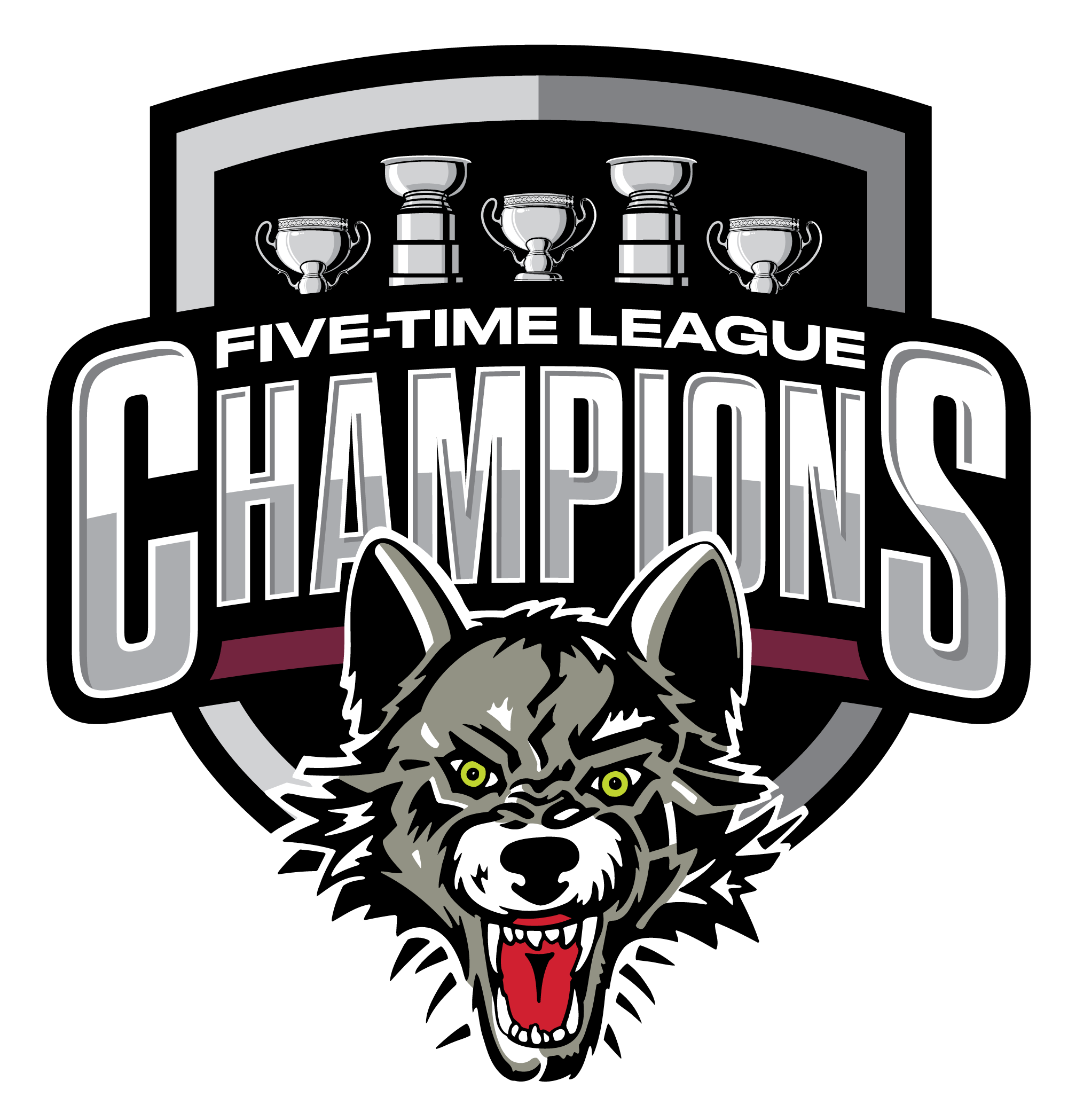
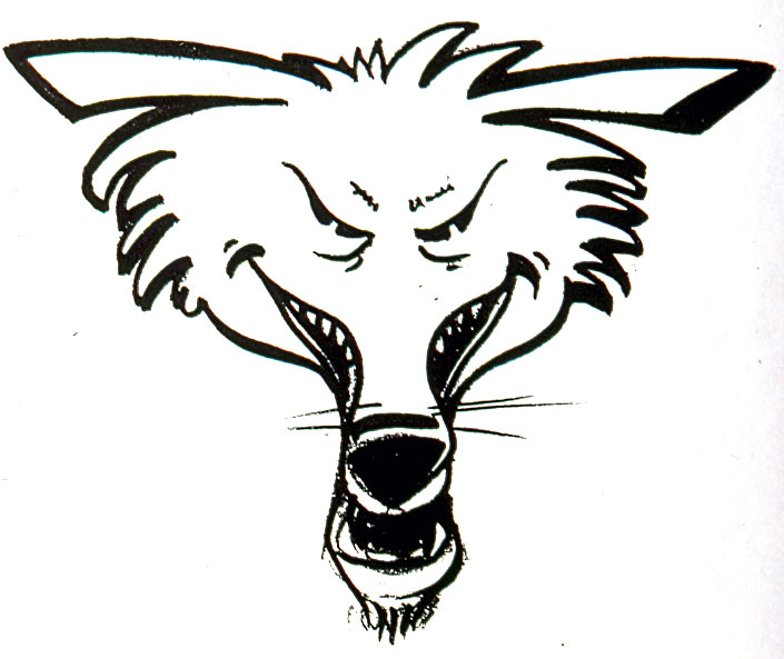
The origins of the Chicago Wolves logo reach all the way back to September 1993. At that time the tough-looking, green-eyed creature that symbolizes Chicago’s newest professional hockey team was just a handful of ideas bouncing around in Grant Mulvey’s head.
The logo began to take shape when Mulvey made a phone call to Villa Park artist/designer Andy Baron. Together, the two began to hammer out the visual identity of what was to become the first International Hockey League team to ever enter an NHL city. And that’s no easy job.
During those 16 months, Mulvey and Baron spent hours thinking, talking and reading about wolves. Mulvey said he like the name because of the nature of the animal. “I wanted to make sure that this team had a name that would last forever, a name that would weather all trends and all obstacles. I wanted a powerful and lasting name. We went through lists and lists of possible names and then one day the name ‘Wolves’ came up, and it stuck for good.”
Once the name was chosen, Mulvey said the next step was to create a dynamic logo that would reflect the personality of the first professional ice hockey team to skate on Rosemont Horizon ice, and still be true to the team’s namesake. “It took a while to get on track with what we wanted with the logo. Our first efforts were cartoony, and I wanted something more realistic. We wanted the face of the wolf to be fierce, yet not intimidating. We wanted a logo that would weather the years and still have the ‘90s look.”
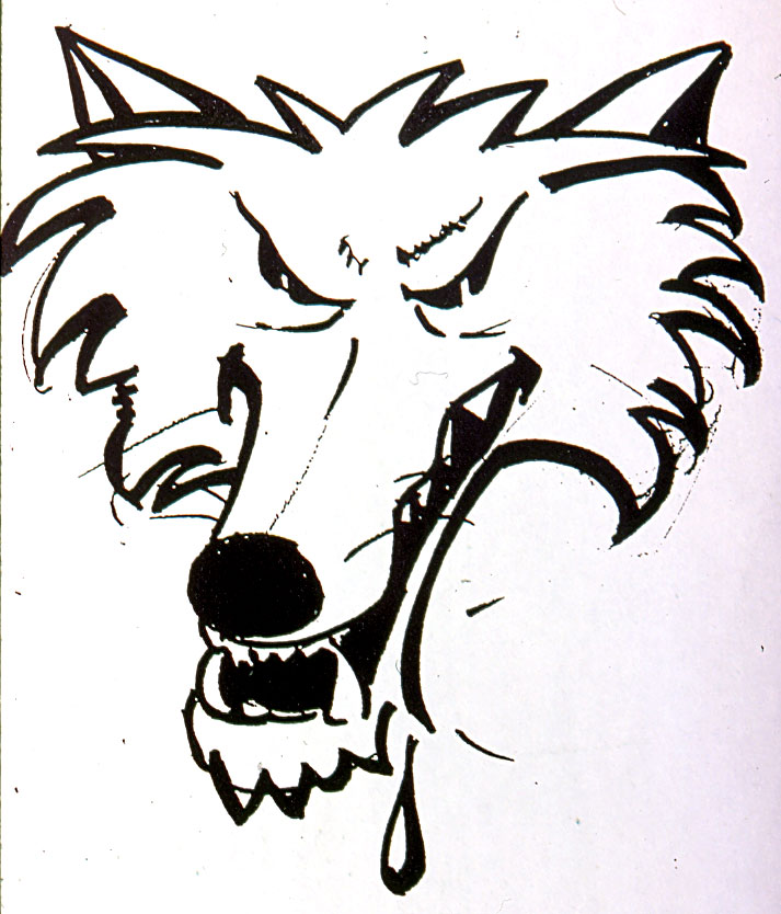
Baron said that going to the library was the first step upon getting the assignment. “We pulled many, many books on wolves and finally found a picture of a lone wolf standing slightly apart from the pack. It was the fiercest-looking wolf, so we worked from that. Between Grant and I, we spent over 70 hours in the studio on the design of the face. It took a lot of patience and hard work on both our parts to come up with a look that was satisfying for us both.”
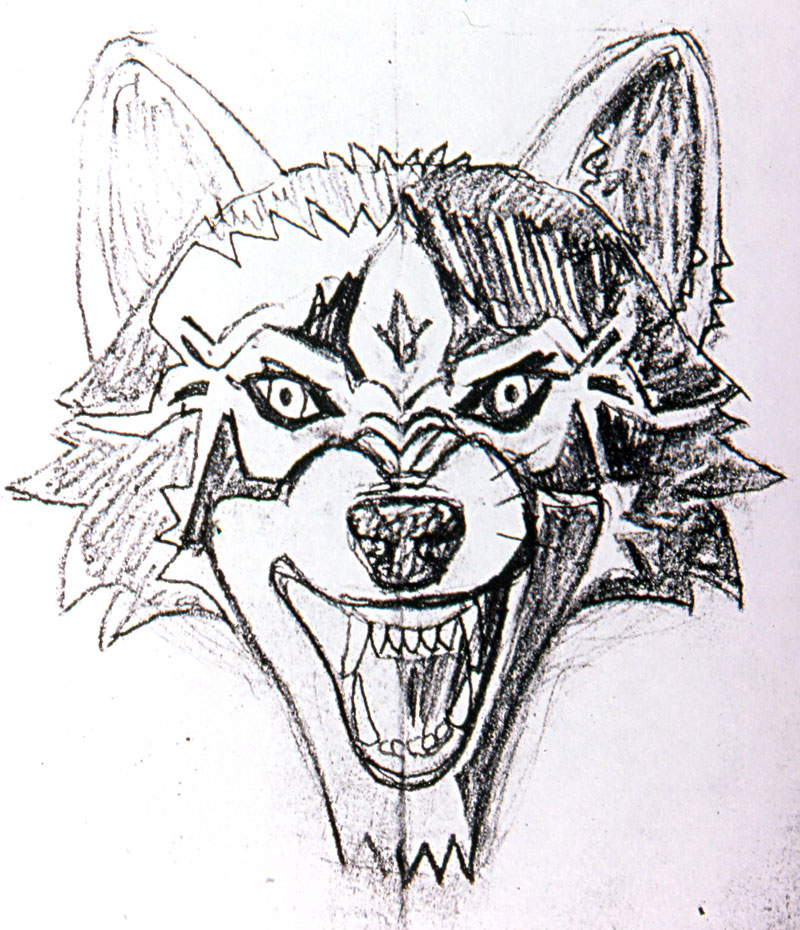
Baron said that the logo changed drastically over the course of its design because he and Grant didn’t care how long it took – it had to be done perfectly. “We focused all our energies on trying to create the most exciting logo the sports industry ever saw, and we didn’t want to stop until we got there. We wanted to show aggression and a look of imposing fear, but we didn’t want it to be ugly or violent-looking. We wanted to show emotions, but we didn’t want it to offend people. There were many things to take into consideration.”
Baron said that the logo went piece by piece, and he and Mulvey agonized over each change. “The most difficult part of the whole process was getting the foundation down, such as deciding whether to have a side view or a front view of the wolf, deciding which way the ears should point, things like that. Once that was decided, it was a matter of fine-tuning, which for me is the fun part.”
It was important to Mulvey that the elements of the logo worked together. “We chose a special color for the eyes to make them more piercing, we put shadows in the face, we made the teeth more crooked and more realistic because life isn’t perfect. The logo is a symbol of the animal and a symbol of the team and the direction we are going.”
Mulvey said that he and Baron pushed themselves to come up with a product they would be happy with. “Every single day for three months I went over to Andy’s studio and we wrestled with it. It eventually got to the point that even the tape on the hockey stick had to be absolutely perfect. We knew that the only way the logo would succeed was if it was perfect, so we had to spend the time. The logo is the foundation of a team, something to look at and believe in, and that’s very important.”
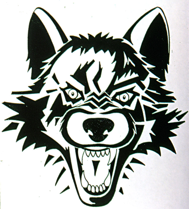
Though Baron and Mulvey both said that they enjoyed working on the logo, despite the difficulty of the project, they also admit that their favorite part was knowing when it was done. “One day when Grant came over,” Baron said, “we made a couple minor changes, and then we stood back and we both just knew that it was finished. I tell you if Rembrandt himself had told me that day that the eyes were a little off, I would have told him that he was a little off. Every part of that logo has a reason for being there, just like every part of this team has a reason.”
After so much effort, Mulvey is proud of the efforts of everyone involved in the creation of the logo. “It turned out far greater even than we thought it would,” he said. “We pushed ourselves to the limits and Andy and everyone should be commended. It’s great to see kids wearing shirts with the logo on them. It’s a very powerful and rewarding thing to see the time you spend go toward good work, and I know it’s the kind of logo that will endure.
“I have three kids,” Baron said, “and this is like my fourth. We expended a lot of time and energy on this project. And because Grant feels so strongly about the identity of this team, the love of the details of the drawing has spilled over to the details of the team and the whole organization, and it will make people fall in love with this team.”
This story originally appeared in the Chicago Wolves “Rare Look” magazine in 1994.
